Lab 01 - Hello R!
Tanzy Love-Solutions
2018-01-18
Solutions in bold.
Data
The data frame we will be working with today is called
datasaurus_dozen and it’s in the datasauRus
package. Actually, this single data frame contains 13 datasets, designed
to show us why data visualisation is important and how summary
statistics alone can be misleading. The different datasets are maked by
the dataset variable.
To find out more about the dataset, type the following in your Console:
?datasaurus_dozenA question mark before the name of an object will always bring up its help file. This command must be run in the Console.
- Based on the help file, how many rows and how many columns does the
datasaurus_dozenfile have? What are the variables included in the data frame? Add your responses to your lab report. When you’re done, commit your changes with the commit message “Added answer for Ex 1”, and push.
The dataframe has 1846 rows and 3 columns. The variables are ‘dataset’, ‘x’, and ‘y’. *
Let’s take a look at what these datasets are. To do so we can make a frequency table of the dataset variable:
datasaurus_dozen %>%
  count(dataset) %>%
  print()
## # A tibble: 13 x 2
## dataset n
## <chr> <int>
## 1 away 142
## 2 bullseye 142
## 3 circle 142
## 4 dino 142
## 5 dots 142
## 6 h_lines 142
## 7 high_lines 142
## 8 slant_down 142
## 9 slant_up 142
## 10 star 142
## 11 v_lines 142
## 12 wide_lines 142
## 13 x_shape 142Data visualization and summary
- Plot
yvs.xfor thedinodataset. Then, calculate the correlation coefficient betweenxandyfor this dataset.
Start with the datasaurus_dozen and pipe it into the
filter function to filter for observations where
dataset == "dino". Store the resulting filtered data frame
as a new data frame called dino_data.
dino_data = datasaurus_dozen %>%
  filter(dataset == "dino")
Next, we need to visualize these data. We will use the
ggplot function for this. Its first argument is the data
you’re visualizing. Next we define the aesthetic mappings.
In other words, the columns of the data that get mapped to certain
aesthetic features of the plot, e.g. the x axis will
represent the variable called x and the y axis
will represent the variable called y. Then, we add another
layer to this plot where we define which geometric shapes
we want to use to represent each observation in the data. In this case
we want these to be points, hence geom_point.
ggplot(data = dino_data, mapping = aes(x = x, y = y)) +
  geom_point()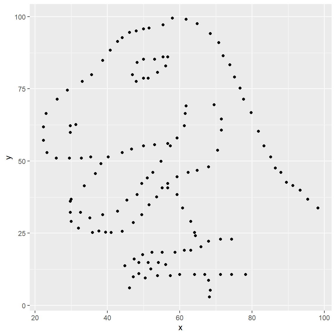
For the second part of this exercises, we need to calculate a summary
statistic: the correlation coefficient. Correlation coefficient, often
referred to as \(r\) in statistics,
measures the linear association between two variables. You will see that
some of the pairs of variables we plot do not have a linear relationship
between them. This is exactly why we want to visualize first: visualize
to assess the form of the relationship, and calculate \(r\) only if relevant. In this case,
calculating a correlation coefficient really doesn’t make sense since
the relationship between x and y is definitely
not linear – it’s dinosaurial!
But, for illustrative purposes, let’s calculate correlation
coefficient between x and y.
dino_data %>%
  summarize(r = cor(x, y))
## # A tibble: 1 x 1
## r
## <dbl>
## 1 -0.0645- Plot
yvs.xfor thestardataset. You can (and should) reuse code we introduced above, just replace the dataset name with the desired dataset. Then, calculate the correlation coefficient betweenxandyfor this dataset. How does this value compare to therofdino?
star_data = datasaurus_dozen %>%
  filter(dataset == "star")
ggplot(data = star_data, mapping = aes(x = x, y = y)) +
  geom_point()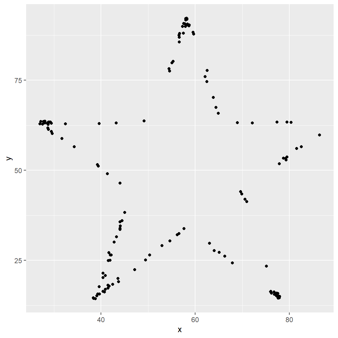
star_data %>%
  summarize(r = cor(x, y))
## # A tibble: 1 x 1
## r
## <dbl>
## 1 -0.0630The correlation in the star data is the same as the correlation in the dino data.
- Plot
yvs.xfor thecircledataset. You can (and should) reuse code we introduced above, just replace the dataset name with the desired dataset. Then, calculate the correlation coefficient betweenxandyfor this dataset. How does this value compare to therofdino?
circle_data = datasaurus_dozen %>%
  filter(dataset == "circle")
ggplot(data = circle_data, mapping = aes(x = x, y = y)) +
  geom_point()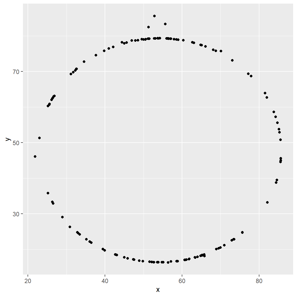
circle_data %>%
  summarize(r = cor(x, y))
## # A tibble: 1 x 1
## r
## <dbl>
## 1 -0.0683The correlation in the circle data is nearly the same as the correlation in the dino data.
- Finally, let’s plot all datasets at once. In order to do this we will make use of facetting.
ggplot(datasaurus_dozen, aes(x = x, y = y, color = dataset))+
  geom_point()+
  facet_wrap(~ dataset, ncol = 3) +
  theme(legend.position = "none")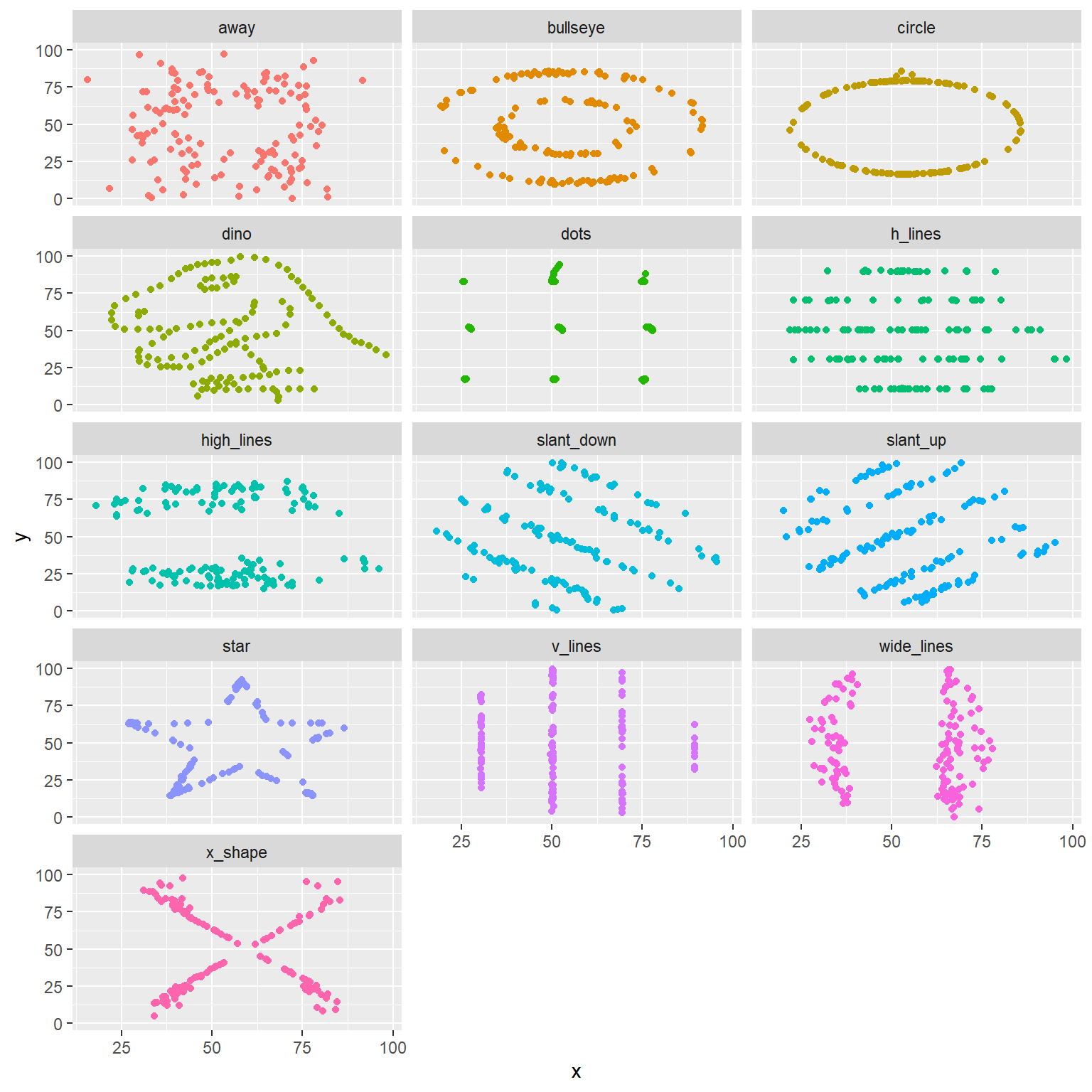
And we can use the group_by function to generate all the
summary correlation coefficients.
datasaurus_dozen %>%
  group_by(dataset) %>%
  summarize(r = cor(x, y)) %>%
  print()
## # A tibble: 13 x 2
## dataset r
## <chr> <dbl>
## 1 away -0.0641
## 2 bullseye -0.0686
## 3 circle -0.0683
## 4 dino -0.0645
## 5 dots -0.0603
## 6 h_lines -0.0617
## 7 high_lines -0.0685
## 8 slant_down -0.0690
## 9 slant_up -0.0686
## 10 star -0.0630
## 11 v_lines -0.0694
## 12 wide_lines -0.0666
## 13 x_shape -0.0656You’re done with the data analysis exercises, but we’d like you to do two more things:
- Resize your figures:
I changed the default figure size to 6 by 6, except for the faceted plot which I set to 8 by 8.
- Change the look of your report:
I changed the theme to “united” and then “sandstone”.
Rubric (15 points possible)
10 points if code and descriptions are complete for all questions. 5 points for >= five commits with informative messages made to the repo.